Launcher

Nothing crazy here. We use the vibrant orange from the website as our background. We then create a lower case h using 8 pixels as the size of our stems & bar, the length of the bar being 12 pixels. Simple!
Main

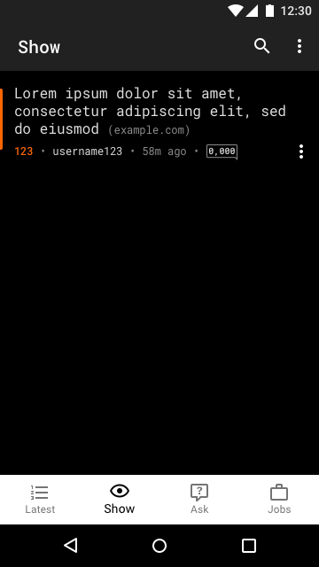
I really like the Pixel 2 XL “Panda” color scheme and that is why I went with contrasting tones for the BottomNavigationView & Toolbar.
No Hamburger and Drawer!!!
I followed the same idea of the list items on HN. The sources of the article is less pronounced but inline with the article headline. This can be achieved using a RelativeSizeSpan and a ForegroundColorSpan.
We have an Orange bar indicate this article is bookmarked .. I’m not entirely convinced this is the best route, perhaps an icon inline?
The subtitle. We have 4 data points: up-votes, user, submit time, comments. We use bullet points, visual indicators, and formatting to condense the information as much as possible. Everything extra goes into the overflow to give us a clean and simple look. The most important information is the headline and keeping the content quickly consumable and skimmable. This is why we are trying to mute any UI noise.
Detail

Let’s get into the details of the details screen 😄
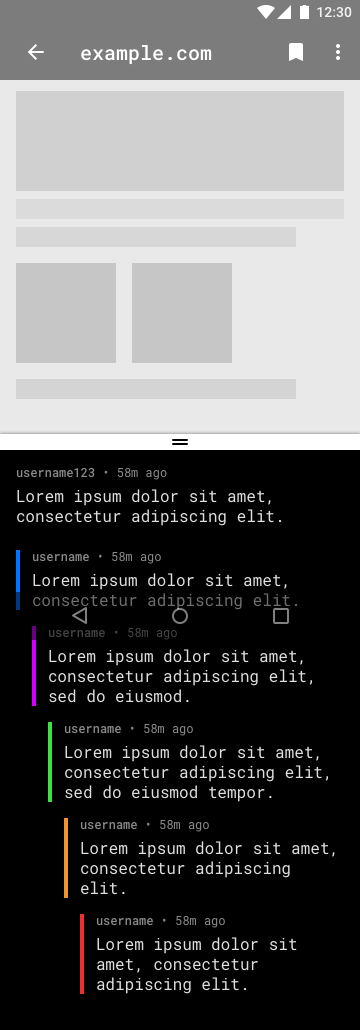
The general idea here was keeping the user on the same screen while browsing web content and comments. They’re both consumable content so why treat them differently? We do this by taking an idea from split screen mode!
Threaded comments: Color scheme borrowed from my favorite reddit app (Sync). Same idea as the Main screen items, quickly consumable. Somewhere in here should be a fab for writing a comment, I was thinking that the fab can appear once you swipe up and increase the size of the comments pane.
The End
I told you this was short! Click here for the sketch file. Thanks 😄

